

Статті
Trend toward victory. Russian advances stall as casualties surge
In early June, we published another analysis of the current situation on the frontline. Today, we explain what has changed since our previous publication. We examine how the situation has evolved along each section of the frontline from north to south, look at which positions have been lost or retaken, and analyze the tactics used by both sides.
First, let’s look at two separate curves. Viewed together, they provide a clear picture of where the frontline is heading overall. And this time, for the first time in many years, we are seeing a trend toward victory over the Russian army.
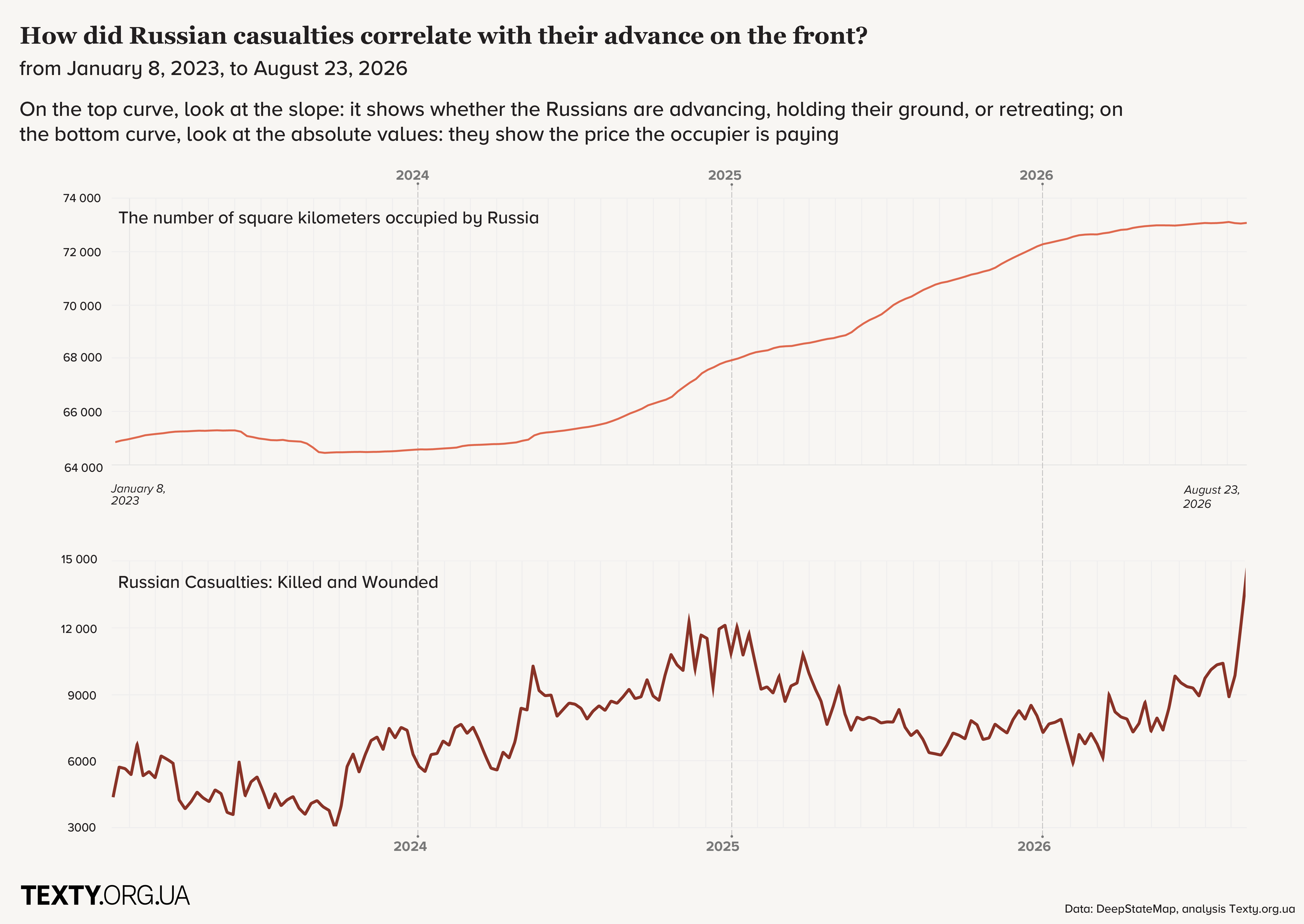
Under conditions of the enemy’s numerical superiority, the ideal picture would look like this: the upper line stays flat while the lower one rises sharply. That is exactly what is happening in August. We are seeing a sharp increase in Russian casualties, while their advance has nearly come to a halt.
This sharp jump followed Mykhailo Drapatyi's appointment as Commander-in-Chief of the Armed Forces of Ukraine on July 22, 2026. However, the first positive trends had already emerged in February 2026, following the appointment of Mykhailo Fedorov as Minister of Defense of Ukraine.
Whether this victorious trend will hold remains to be seen in the coming months.
We did not separately investigate whether a change in the Commander-in-Chief can bring about such rapid changes on the frontline. However, there have been many personnel changes in the Armed Forces of Ukraine over the past month: armchair generals and colonels are losing their positions, while combat officers with modern views on warfare and a commitment to preserving soldiers’ lives are returning to command positions at various levels.
We have been regularly publishing a graph showing enemy losses and advances for the past several years. After our previous publication, we received a lot of criticism — and even more hate. So we want to explain why we chose this particular type of graph.
We have been criticized for comparing two graphs that use different types of data: the upper one shows cumulative figures, while the lower one shows weekly data. We believe this comparison is valid if we are not looking at the absolute numbers on the upper curve, but at the SLOPE of the line.
In other words, we look at the rate at which territory is being captured — the slope of the upper curve — and compare it with losses per week. The lower curve shows a rate, that is, the amount of something over a given period of time. In our case, it is the number of Russian casualties per week.
Why don’t we show the rate on the upper graph as well? Such figures can fluctuate considerably. If we showed only these fluctuations on both curves, they would become difficult to compare: the eye gets caught up in random spikes, making it harder to see the overall trend.
Instead, our approach is:
at the top, we look at how quickly the territorial situation is changing, based on the slope of the line over a given period of time.
at the bottom, we look at what this is costing the enemy — Russian casualties per week.
This combination makes it possible to quickly see the bigger picture without getting lost in minor fluctuations.
There is another very important point: you can immediately see the different phases of the war across the entire period.
This type of graph allows us to conclude quickly:
- October 2023 – August 2024: significant Russian losses, limited territorial losses — the situation is okay.
- October 2024 – January 2025: very heavy Russian losses, but also faster territorial losses — the situation is difficult, but under control.
- After that, enemy losses decline, while from May to August 2025, territorial losses accelerate — the situation is bad.
- September – October 2025: Russian losses increase, and their advances slow down, suggesting stabilization.
- November 2025 – January 2026: the situation deteriorates significantly again.
- February 2026: the situation begins to level out.
- March – May 2026: the situation shows a trend toward improvement.
We considered various graph formats, including one where both the upper and lower curves showed cumulative Russian casualties and cumulative territorial losses. That graph illustrates the trend less effectively because it requires comparing two slopes rather than one. Another option was to show smoothed rates of territorial losses and enemy casualties on the upper and lower graphs. However, we ultimately settled on the version you see here.
Підпишіться, щоб отримувати найкращі статті на e-mail (раз на два тижні)

Підписатися